

Student Room Stay
A vetted homestay marketplace connecting international students with trusted U.S. host families.
ROLE
Senior Designer
TIMELINE
2 years
SCOPE
- Logo
- Brand identity
- Marketing site
- Design system
- Platform UI
- Social media
- Pitch decks
TOOLS
- Figma
- Webflow
- Adobe Suite
OUTCOME
Rebranded end to end. Contributed to a lift in partner deal flow. Acquired by Melt Education, a Steve Harvey company.
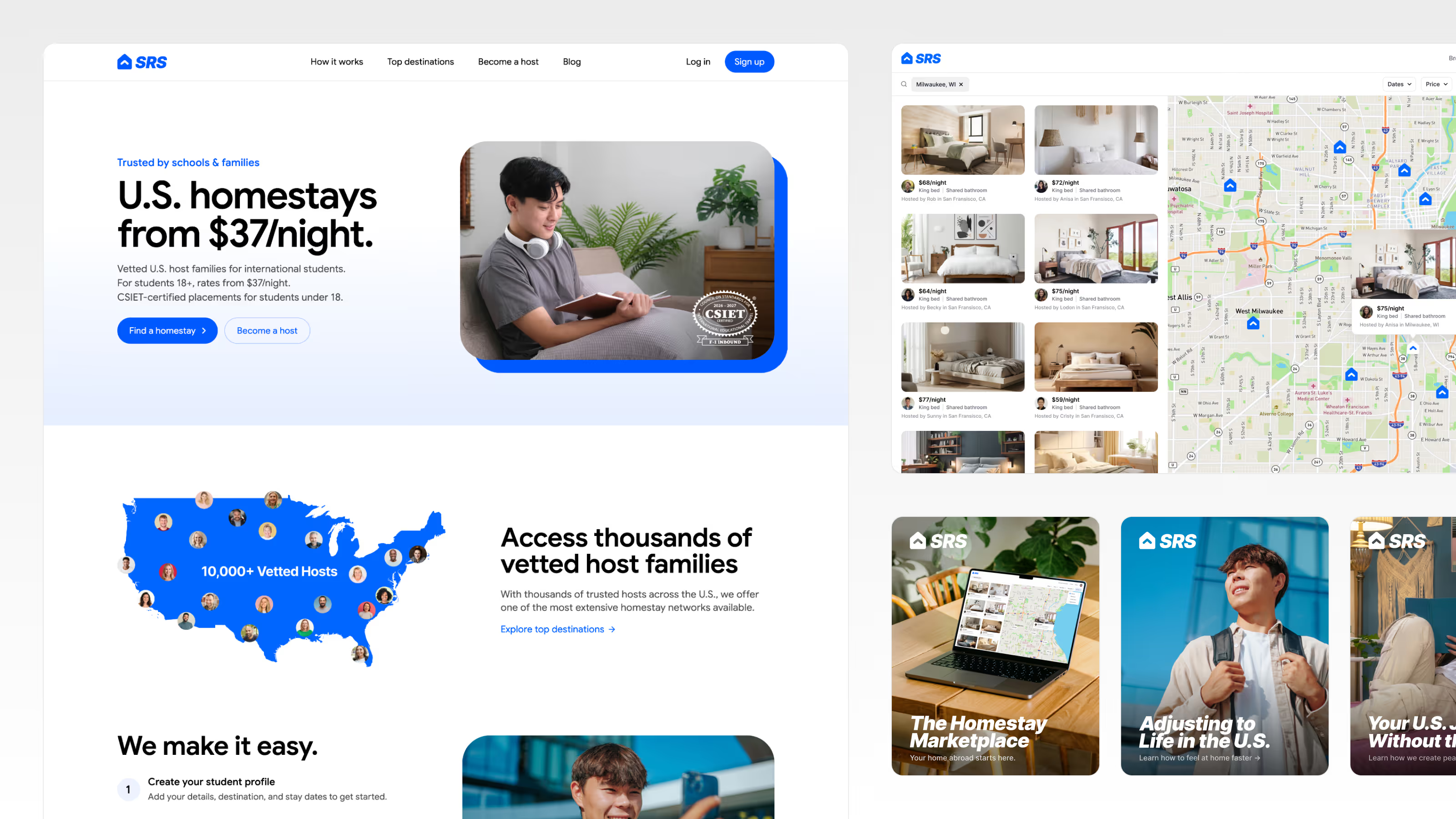
One brand across identity, marketing, product, and social. Every surface designed and shipped by one person.
One designer. One system. From muddy to trustworthy. After ten years in operation, SRS had real traction, but its design had fallen below the bar the business had earned: dated, muddy, and harder to use than it needed to be. I rebuilt the entire visual system solo, from logo to live product, and the work contributed to a lift in partner deal flow and helped position the company for its 2024 acquisition by Melt Education.
The Problem
StudentRoomStay had a decade of operating history, but the design hadn't kept pace with the business. The brand looked dated, the marketing site was muddy and hard to read, and the platform had grown more complex than the job it was built to do. Weak hierarchy, dense layouts, inconsistent type and color, and no guidelines holding any of it together. The public face of the company undersold the maturity of the actual business.
For a marketplace whose entire job is convincing parents to trust strangers with their kids, that wasn't a cosmetic problem. A confusing, hard-to-read experience quietly signals carelessness, the exact opposite of what a family needs to feel, right at the moment the company needed to look acquisition-ready.
For a marketplace whose entire job is convincing parents to trust strangers with their kids, that wasn't a cosmetic problem. A confusing, hard-to-read experience quietly signals carelessness, the exact opposite of what a family needs to feel, right at the moment the company needed to look acquisition-ready.
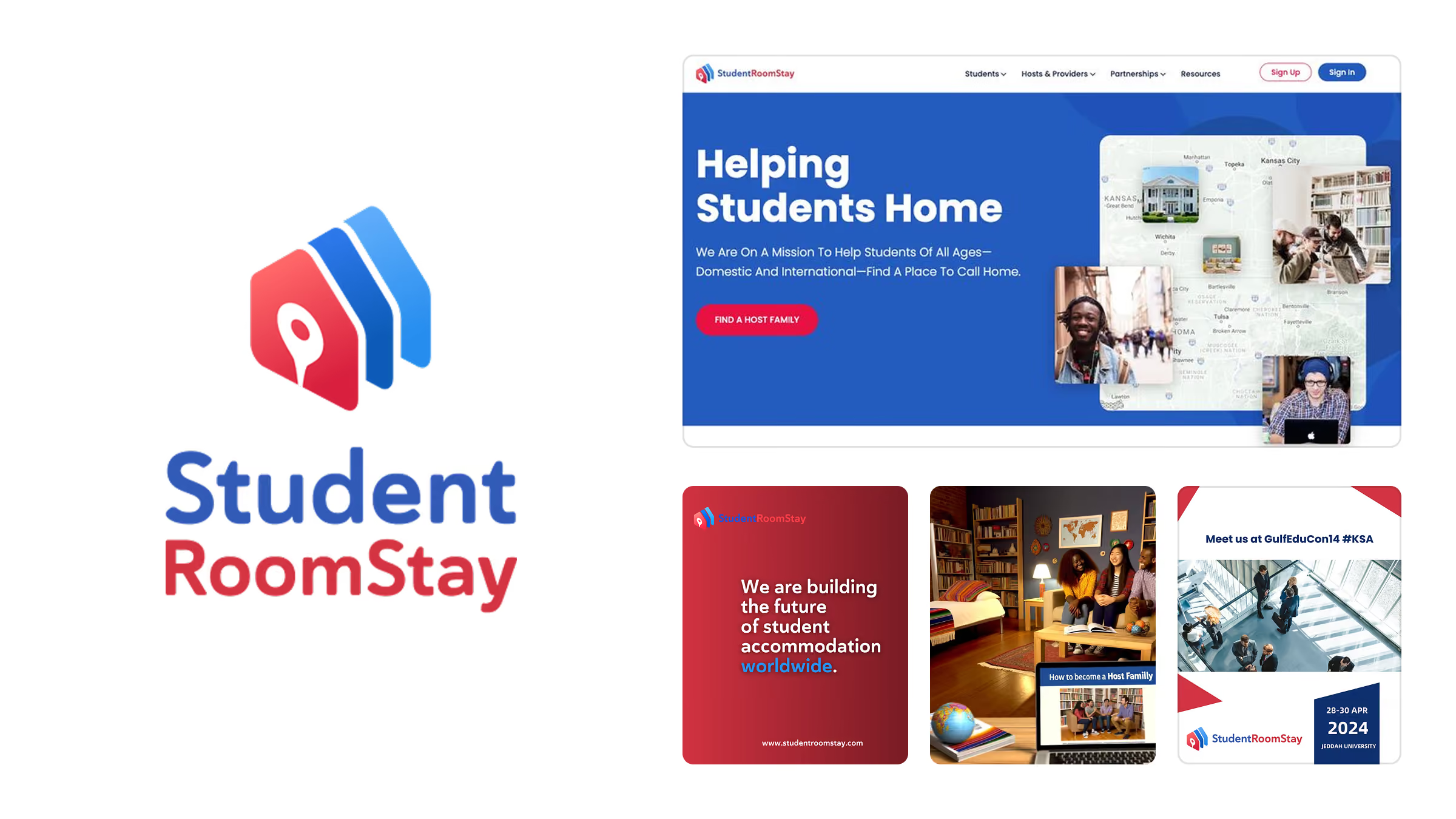
Where I started. Dated, dense, and harder to use than a trust business can afford.
The Approach
I owned the entire visual function as a one-person department, using AI tools to operate at the scale of a small team. I started by auditing every existing touchpoint to map exactly where the experience was failing, then rebuilt from a single positioning idea: strip away the muddiness until the company's ten years of substance could actually be seen. Clarity was the strategy. If a decision didn't make the experience simpler, clearer, or more trustworthy, it didn't ship.
THE WORK
01. Modernize without erasing ten years of equity
Rather than throw out everything recognizable, I kept what carried real equity: the human, day-in-the-life imagery of students and host families, and the name everyone already used. Students, hosts, partners, and the internal team all said "SRS," never "StudentRoomStay," so the shorthand became the official mark.
The old logo, three overlapping houses in red and blue with an icon layered on the front, was doing too much. I replaced it with a single house silhouette carrying an upward arrow: growth, transformation, the idea that you arrive at the house and grow. Set in Inter to give the brand a modern, credible voice where the old semi-rounded typeface read like it was made in a day, and anchored in blue for its quiet association with trust.
The old logo, three overlapping houses in red and blue with an icon layered on the front, was doing too much. I replaced it with a single house silhouette carrying an upward arrow: growth, transformation, the idea that you arrive at the house and grow. Set in Inter to give the brand a modern, credible voice where the old semi-rounded typeface read like it was made in a day, and anchored in blue for its quiet association with trust.
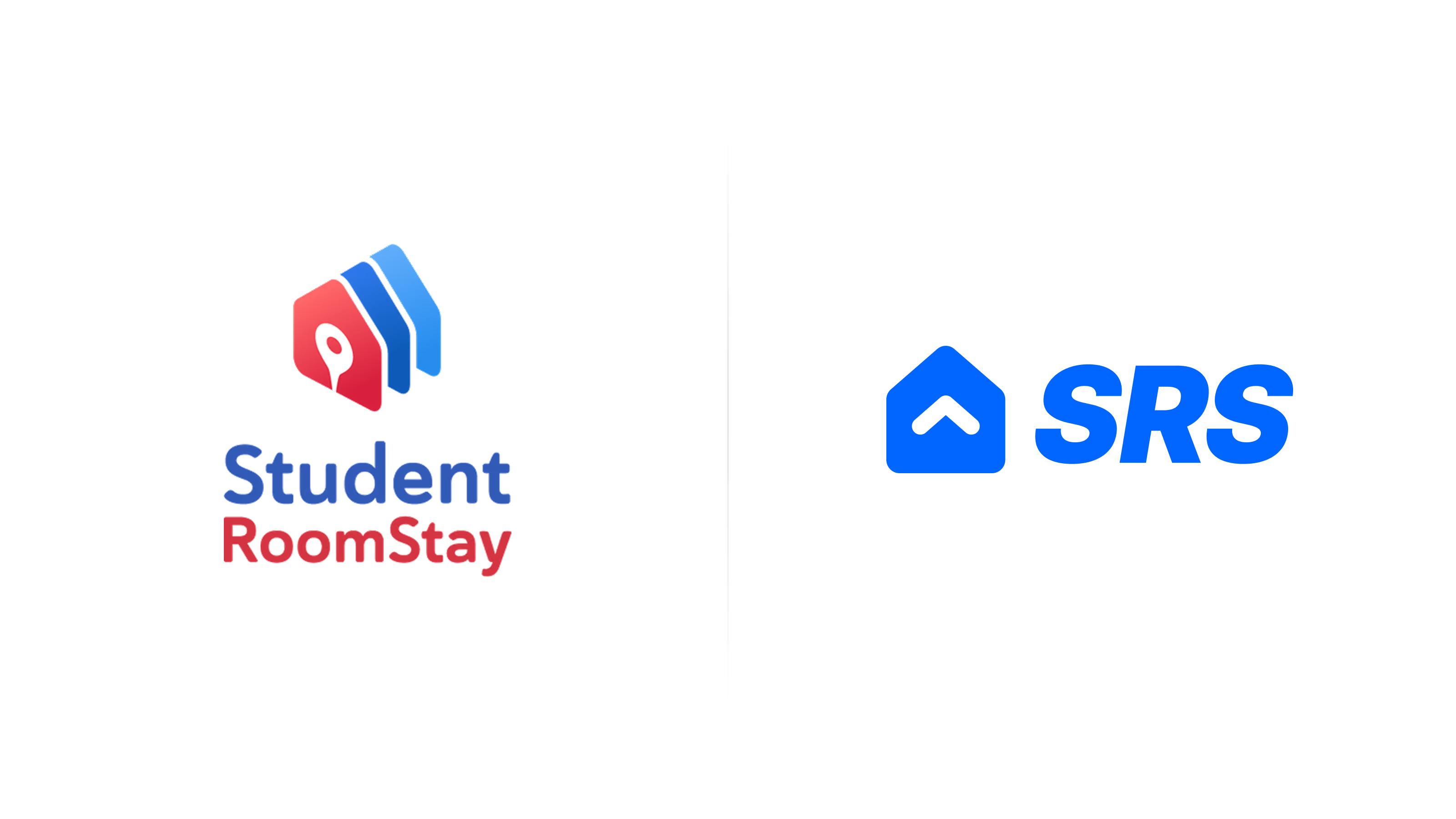
Familiar enough to keep ten years of recognition, rebuilt enough to carry the next ten.
02. Clarity over complexity
The site had sprawled into pages that weren't earning their place, styled in half a dozen competing directions. I consolidated the sprawl, unified everything into one minimal but warm system, and put the most work into the homepage, which had to do the hardest job on the site: explain a brand-new category (a vetted homestay marketplace), surface every offer, and make the differentiators, vetted hosts and real selection, impossible to miss without adding clutter. Trust signals like CSIET certification sat front and center, and even the stock imagery was curated obsessively until every photo felt like the real families the brand served. Over two years, weekly traffic grew from under 1,000 visitors to over 2,000.

Same company, same offers. The difference is how hard a parent has to work to understand them.
03. From manual back office to self-serve marketplace
For most of its history, SRS ran placements and host payouts through AMP, an internal tool where everything was tracked and paid manually. The new platform turned that into the first true homestay marketplace: students and families could browse vetted hosts, chat, book, and pay entirely on their own, with host payouts automated. I owned the user experience, translating the founders' vision into flows that made sense, pushing back on complexity at every step, and working alongside the developers on what could actually ship.
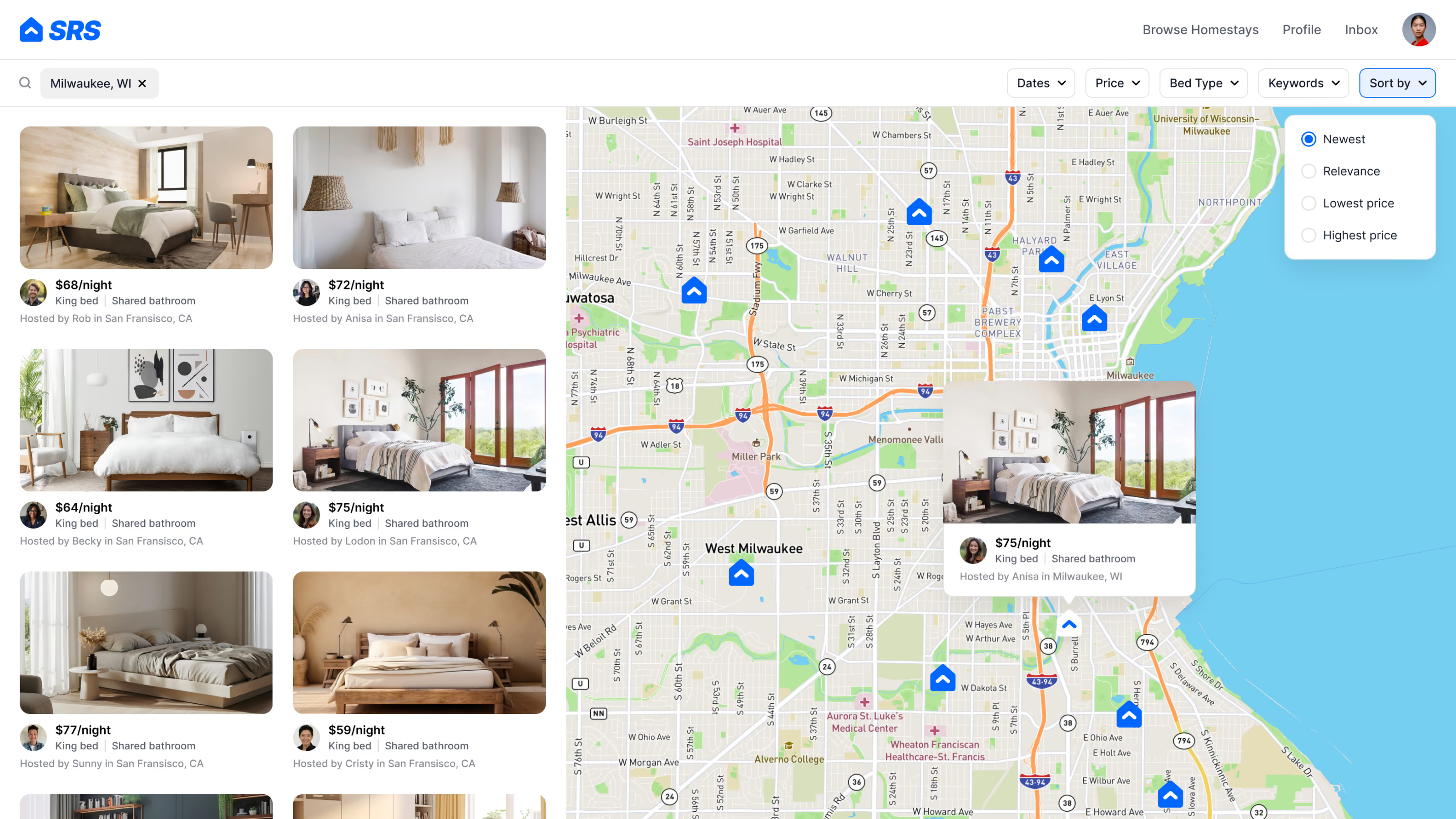
Browse, chat, book, pay. What used to be manual back-office work became a self-serve product.
04. Design for trust as the core brand job
Because the marketplace runs on families trusting strangers with their kids, credibility was the primary design goal, and in practice credibility meant honesty and calm. The booking flow shows what that looked like. Families could pay just the first month up front and continue monthly instead of covering the full stay at once, with the billing terms stated plainly and no interest. Payment fees were disclosed before choosing, not buried at checkout: credit card with its processing fee named, or bank account with none. And every charge stayed visible on the way to paying, chosen services like meals and school transportation listed by name, with a full price breakdown one click away. No fake urgency, no pushy popups, nothing flashy. Just a calm, legible flow a parent could move through without ever second-guessing the company behind it.
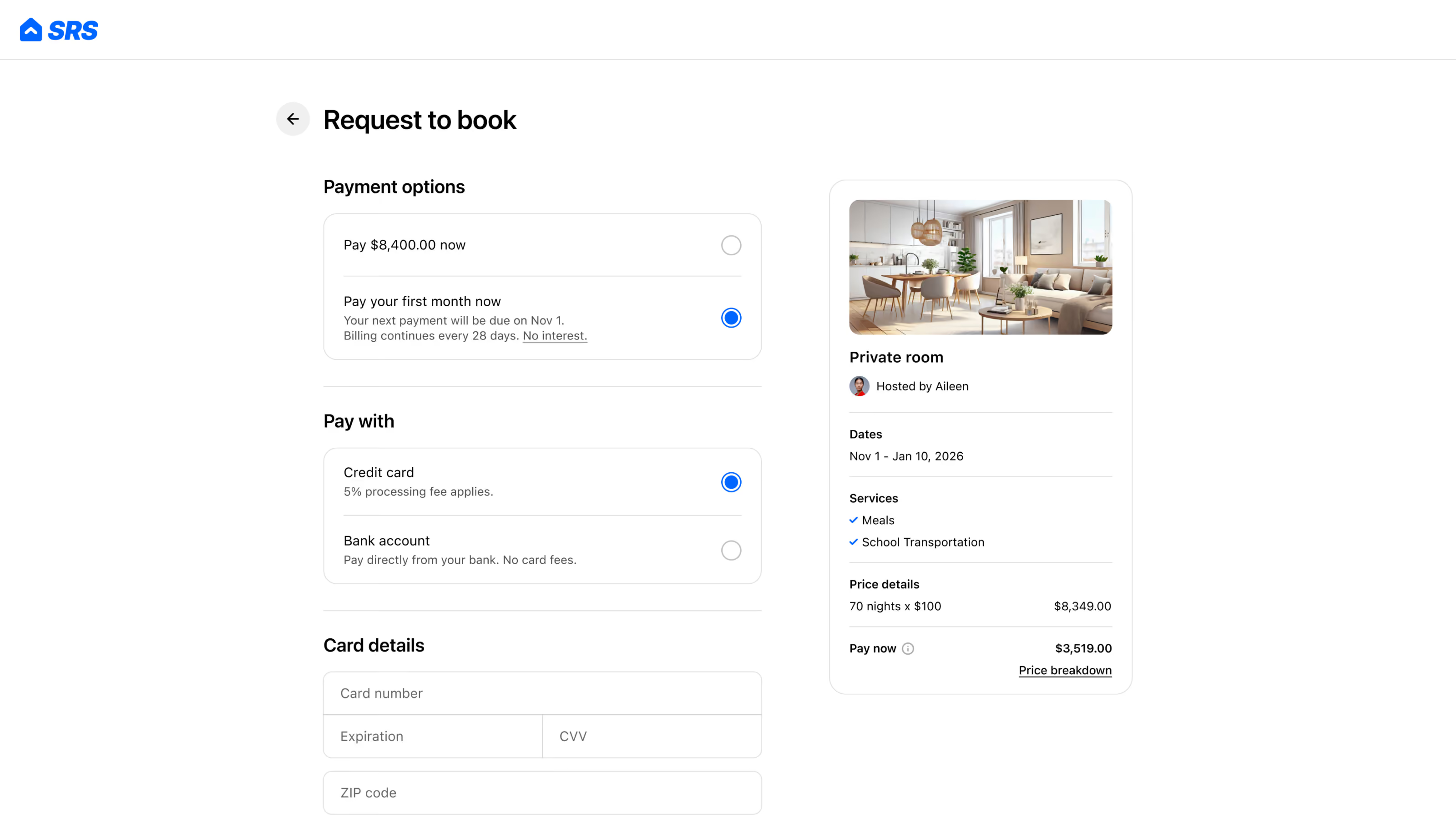
The booking flow, tuned toward one question: would a parent trust this?
05. The brand in the wild
Social was rebuilt from scattered and inconsistent to clean, modern, and enthusiastic. Because students found SRS through agents rather than directly, the feed's job wasn't conversion, it was legitimacy: making the company look as real and credible at a glance as it actually was, for every parent, host, and partner who checked before committing.
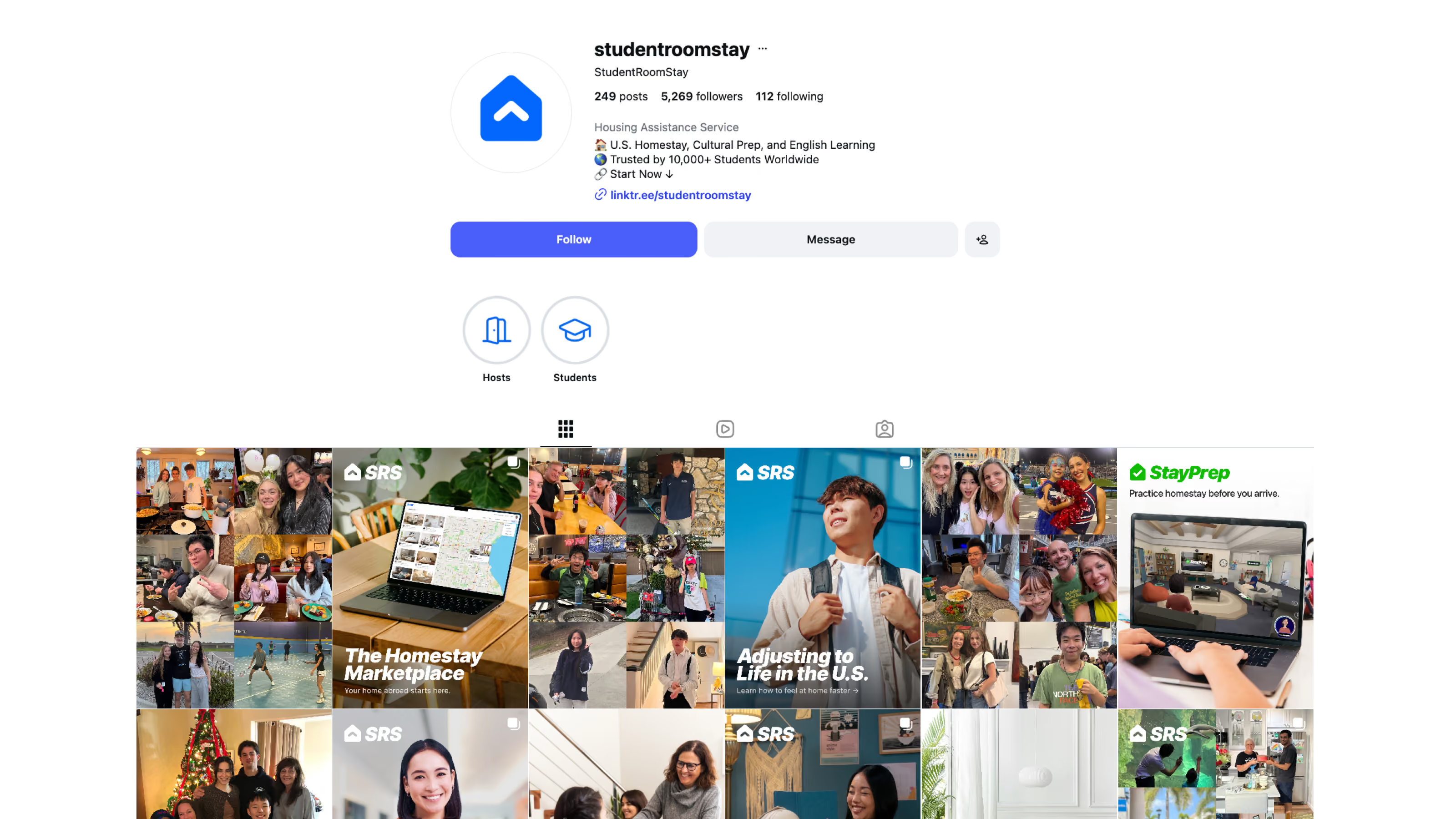
The feed's one job: look like a company you'd trust with your kid.
The Outcome
The rebrand gave a decade-old company a visual identity that finally matched its substance:
- Weekly site traffic more than doubled over two years, from under 1,000 visitors to over 2,000
- A noticeable lift in B2B partner deal flow, supported by partner pitch decks I designed that helped land deals
- One design system powering marketing, product, and social, built and maintained by a single designer
- Helped position the company for its 2024 acquisition by Melt Education, where I was retained to lead the parent brand across three sub-brands